826 National Brand Update
826 National
Brand Update, Website Redesign
826 National amplifies the impact of our national network of youth writing and publishing centers, and the words of young authors. We serve as an international proof point for writing as a tool for young people to ignite and channel their creativity, explore identity, advocate for themselves and their community, and achieve academic and professional success.
My work with 826 National began in 2012 when they reached out for help creating an annual report. When the time came for a brand refresh and website redesign in 2017 we had established a very strong working relationship and my understanding of their story and identity was deep. Youth writing is at the center of everything 826 National does, and what better icon than a pencil to represent that story? For the band mark refresh, we stuck with the functionality of the original footprint but integrated the pencil concept in a fun and interesting way. The new mark communicates youth writing even when the supporting “tutoring, writing, publishing” copy cannot be feasibly used in production.
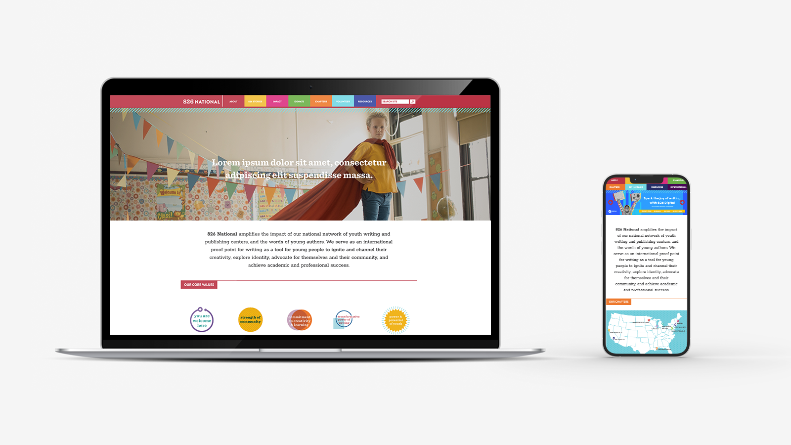
The previous 826 National website was not responsive/ mobile friendly, which was hurting their SEO performance and visibility after Google updated their search algorithm to favor responsive sites first. The new site needed to be responsive, and maintain aesthetics and functionality across devices.

The original site architecture was also unnecessarily complex and sometimes redundant, which was an earnest result of building a website as you are building an organization. We knew we needed to tighten up the information hierarchy to honor the efficiency of 826 National’s programs. Physical models were constructed and tested in the studio space by printing out all of the original site content and imagining various user flows. This process got us through iteration quickly and triggered innovative thinking through physical interaction with the content and architecture.
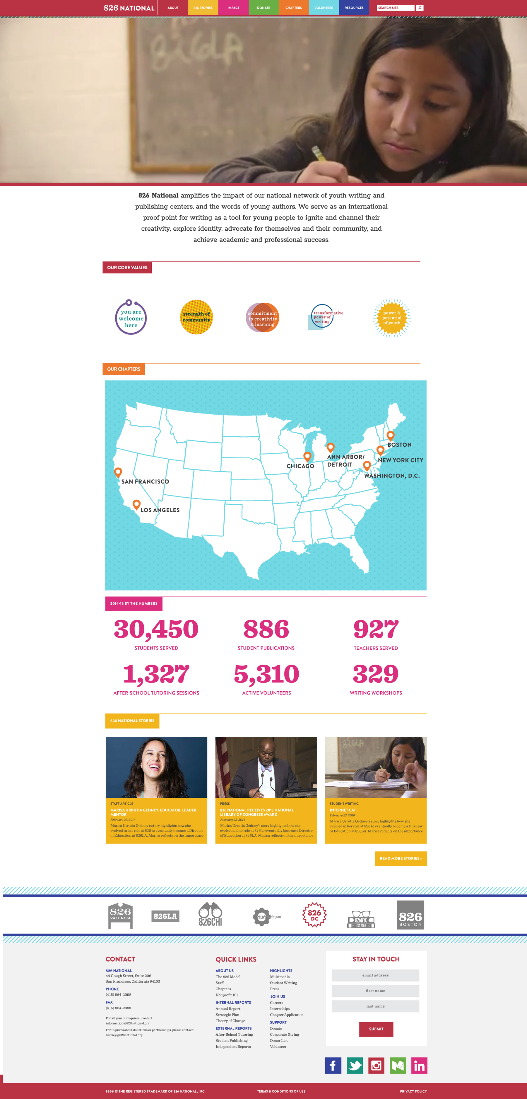
The design voice for the user interface and content was born out of a style guide that was developed over several years while working collaboratively on annual reports, strategic planning materials, fundraising graphics, events, and awareness campaigns. These existing visual strategies were used to create functional web assets such as icons and navigation elements, as well as for site content such as phot treatment, illustration and infographics.
